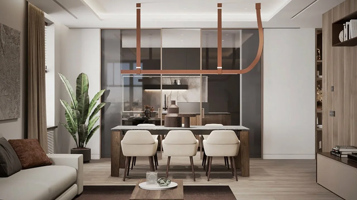
Visualization in architecture is a bridge between the drawing and the future space, which helps the customer understand the scale, materials, light and atmosphere even before construction begins. A competently assembled visual image reduces the number of edits, speeds up coordination, and makes the discussion of the project substantive.
In order for the visualization to work on the idea, it is important to think not with a “picture”, but with a scenario of perception: from the first glance and the route of movement to the sensation of texture and reflection. Below are practical ideas and tips that will help improve the quality of pitches and make them more convincing.
What exactly to visualize: goals and a set of materials
Before starting, fix what decision the visualization should confirm: planning logic, facade composition, nature of materials, lighting or usage scenario. The more precise the target, the easier it is to choose a format (static renderings, diagrams, VR/AR, architectural animation) and not spray.
Basic set of initial data
- Concept: key idea, references, limitations and priorities.
- Geometry: actual model, levels, axes, marks, thicknesses, openings.
- Materials: list of finishes, sample brands/series, replacement tolerances.
- Light: orientation to the cardinal points, time of day for key species, types of lamps.
- Environment: site context, neighboring buildings, vegetation, traffic/pedestrian flows.
Choosing a “package” of visual materials for the task
A common mistake is to make many identical angles instead of a small set of different ones. Optimally combine:
- 1–2 key exterior views (first impression and scale in context).
- 2–4 interior views (light, materials, depth of space).
- 1 accent frame (facade detail, node, entrance group, landscape element).
- Schemes: functional diagrams, insolation, movements, stages.
Selecting the angle and height of the camera for readability of the volume
The readability of the volume in architectural visualization is determined by how clearly the viewer “reads” the dimensions, proportions, and relative position of the parts of the building. The angle and height of the camera control this perception more than materials and light: the wrong shooting point can “flatten” the shape, distort the scale and make the facade unrecognizable.
The task of the architect-visualizer is to choose such a position of the camera, where the volume is demonstrated honestly and expressively: the key planes are visible, the protrusions and recesses are logically read, and the perspective emphasizes the constructive idea. Below are practical guidelines that help you quickly come to a confident composition.
Practical guidelines for choosing a camera
- Start with the “explanatory” angle of 3/4: two facades in the frame usually read better than one – depth appears, the volume and thickness of the elements are clear (portals, bay windows, openings are blocked).
- Control the height of the camera through the task:
- The human level (conventionally “from the ground”) enhances the sense of scale and presence, but requires accuracy with verticals.
- Medium height (at the level of the second or third floor) often gives the most “readable” geometry: it is less blocked by the foreground, the plasticity of the facade is clearer.
- A raised point (from above) helps to show the layout of the territory and the interrelationship of volumes, but it can weaken the impression of height and monumentality.
- Keep the verticals straight: use them if necessary vertical perspective (two-point) or adjust the tilt of the camera so that the walls do not “fall”. The tilt is justified only if it serves drama and does not distort the meaning of the project.
- Watch for perspective “compression”: too wide-angle view makes nearby elements disproportionately large, and distant ones – small. If the volume seems “stretched”, move the camera back and narrow the viewing angle.
- Check the silhouette and boundaries of the volume: it is easier to see the purity of the form against the background of the sky and contrast. If the silhouette “tears” at random intersections (tree, lantern, frame edge), move the camera or change the height.
- Show depth through overlap: a small foreground (porch, shed, piece of landscaping) helps to read distances, but should not obscure key geometry.
- Choose the main accent and subject it to the perspective: entrance group, public corner, dominant of the roof or the rhythm of the facade – one priority per frame. Everything else is support, not competition.
- Make three basic versions: “from the ground”, “medium height”, “from above” – and compare where the volume is read more clearly.
- Choose a 3/4 angle as a starting point and refine the rotation of the building relative to the camera until a clear depth appears.
- Check the verticals and proportions: if the shape “breaks”, adjust the perspective or reduce the viewing angle.
- Remove visual interference: intersections at the edges of the frame, extra objects in the foreground,”clogged” background.
- Fix the frame as a standard and use the ego for the series (day/night, season, facade options), maintaining comparability of decisions.
The result: a good angle and height of the camera is a balance between expressiveness and accuracy. Choose a point where at least two planes are visible, the verticals remain manageable, and the perspective does not distort the proportions. Then the volume will be read quickly, confidently and “architecturally” – without the need to explain the project in words.